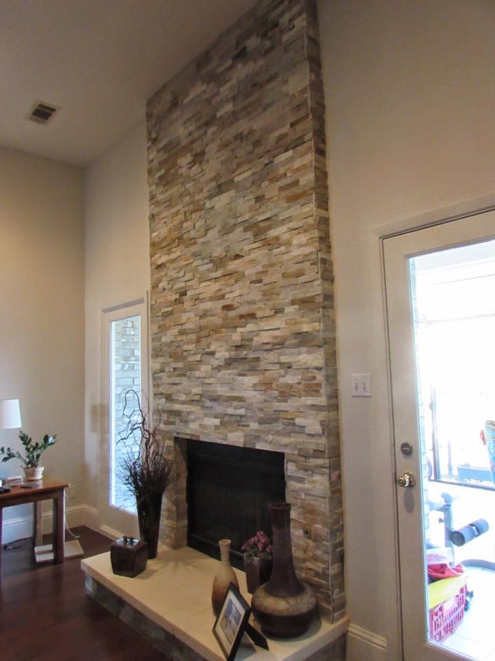
Neutral Debates: Grey vs Beige in Your Decor
Whether you embrace color, or hide from the wilder hues, neutrals are essential to any design: they form the backdrop to the boldest colour palettes and the airiest atmospheres, keeping us from feeling overwhelmed and tying disparate hues together. However, there are two major sides one has to choose from when selecting a neutral: beige vs. grey. To help settle the Great Neutral Debate (at least in your own home), here's some advice on the best both grey and beige have to offer.
Pros and Cons
-Beige: Fans of beige find its warmth inviting, lending a natural quality and adding a human touch not found in colder colours like silver or stark white. However, some find it offputtingly traditional, with a less clean look than crisp greys. Ultimately, the fact that it does contain some undertone will result in more contrast when paired with stronger hues, creating a sense of a more colourful space.
-Beige: Fans of beige find its warmth inviting, lending a natural quality and adding a human touch not found in colder colours like silver or stark white. However, some find it offputtingly traditional, with a less clean look than crisp greys. Ultimately, the fact that it does contain some undertone will result in more contrast when paired with stronger hues, creating a sense of a more colourful space.
-Grey: Those who love grey appreciate the utter simplicity of a colourless colour, while those who don't share this passion will find it often find it cold or dreary. Greys with minimal undertones are the most truly neutral hue possible, so they can pair well with literally anything else -- the "value" (darkness or lightness) becoming the important factor for creating contrast or harmony.

-Ultimately, one of the best ways to use either grey or beige is by actually mixing them together, allowing the contrast between them to highlight the beauty of both. Add warm pillows to a silvery sofa, layer a sandy jute rug on a cold stone floor, or even use two different tones on the walls: the mix is guaranteed to be relaxing but not boring, and sophisticated without feeling too serious. Or, if you really love the combination, you can take the Grey+Beige formula a bit more literally...
The Best of Both Worlds
-Because contemporary design is all about mixing, today we often see a favourite new colour, a hybrid of grey and beige called "greige." Whether you see it as a toned-down beige or a warmed-up grey, greige takes on the sophisticated simplicity of grey, adds the softness of beige, and creates an atmosphere of liveable, demure elegance.
-While the subtlety of greige may not translate into a small accessory, it makes an excellent shade for wall treatments, drapery, and other large canvases that let its hidden depths speak (while forming the perfect accompaniment to virtually any colour scheme). This is why Benjamin Moore's OC23 Classic gray is my ultimate go-to wall paint: it can hold its own, or play second fiddle, allowing it to run throughout a entire space without ever feeling out of place.
If you prefer to choose sides, here are some of my favourite Benjamin Moore hues from each side of the neutral battlefield:
Beige:
white: CC-70 Dune White
midtone: CC-90 Natural Line
dark: CC-510 Buckhorn
Grey:
white: 2121-70 Chantilly Lace
midtone: OC-26 Silver Satin
dark: 2121-10 Gray
Here in Texas, we have a lot of beige … and travertine ... and warm neutrals. Not that there’s anything wrong with warm neutrals, but, if you WANT to go gray, if you want a cooler palette, if you want a change in your look... How do you do it without the clash?
Chances are you have warm neutrals everywhere - most people around here do.
If you have travertine or travertine-like tile on floors, backsplashes, bathrooms, etc., then warm neutrals will follow: warm neutral granite counters, carpet, paint, window treatments, furniture, etc.If you don’t have the luxury of being able to redo everything in your beige interior but want some grey, I’ve got just the thing for you -


No comments:
Post a Comment